Update: February 2023. The postdoc at Princeton (February 2016 to February 2018) focussed on a long-term ethnography of the Intergovernmental Panel on Climate Change (IPCC). One of the conditions stipulated on the Memorandum of Understanding our research team signed with the IPCC is that we would not publish any results until after the Sixth Assessment Report (AR6) concluded, which will be in March 2023. So, in order to generate research findings that I could publish from, I conducted the ethnography I described below. To see the outcome of the study, see the article I published here: Vardy, M. (2020). Relational agility: visualizing near-real-time Arctic sea ice data as a proxy for climate change. Social Studies of Science, 50(5), 802-820.
September 15, 2016. How can we see the impact of anthropogenic climate change in nature? And what sense is it possible to make of visualizations of climate change? To explore these questions, I’m currently conducting ethnographic fieldwork at the National Snow and Ice Data Centre in Boulder Colorado.
The press release announcing the annual sea ice minimum was sent out today and has been picked up in places such as the Washington Post and the Toronto Star. The sea ice minimum is a notable event in contemporary narratives about climate change impacts, and this year’s minimum is statistically tied for the second-lowest since satellite observations began.
As Janet Vertesi writes in her superb ethnography of the NASA Mars Rover project, scientific visualizations of Mars are produced as social accomplishments that allow us to see nature in particular ways. Here at NSIDC, the Arctic Sea Ice News & Analysis team consists of not only scientists but also software developers, managers, data operators, technical writers, and media and communication specialists, all of whom must coordinate their activities with each other (and several outside institutions) in order to successfully produce visualizations of sea ice. This social accomplishment allows us to see the impact of climate change in nature, but visualizations of sea ice are not a simple mirror; they must be read in a particular way, requiring audiences and publics to interpret the images within contested social and political contexts.
One of the reasons I find sea ice such an interesting and vital topic is because it is the material foundation for ways of life of Arctic Indigenous peoples, as documented in places such as the Inuit siku (sea ice) Atlas (and as I wrote about in 2014 for TOPIA: The Canadian Journal of Cultural Studies). So when we look at scientific visualizations of sea ice, it’s not only the impact of anthropogenic climate change that can be seen, but also, potentially, a prompt to consider the ethical-political question of what it means to be acting with geophysical force, a geophysical force that is disrupting peoples’ homelands. This opens up questions of how to think politics and subjectivity in an age of climate change.
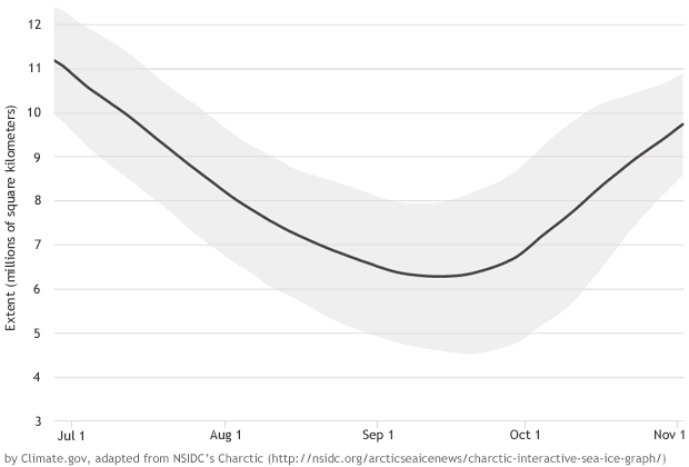
For my fieldwork, I’m conducting participant-observation with members of the Arctic Sea Ice News & Analysis team. They are the folks who compose the blog that provides a public analysis of near-real-time sea ice data, the Daily Image Updates, an interactive sea ice visualization, as well as the visualization of the annual growth and decline of Arctic sea ice shown above. Thus far I’ve conducted about a dozen formal qualitative interviews at NSIDC, and over the next little while I’ll be writing up my analysis and checking it with the people I’ve interviewed. Through this work, I hope to contribute to ongoing discussions about ethical political responses to climate change.
